Philanthropy & Non-Profit
Dads Hug Too / 2.0
The Brief: Dad’s Hug Too is an Oklahoma-based nonprofit that provides father-figure mentorship and support to LGBTQ+ youth who may lack affirming paternal presence in their lives. Founded by friends of mine, the organization needed visual identity that communicated both strength and tenderness—the capable hands of someone who’s worked hard, extended in genuine care.
The Challenge: The founders wanted a logo depicting a “working hand” (weathered, capable, grounded) reaching out in embrace. Not a soft corporate gesture, but the real thing: the hand of someone who’s been in the shop, who knows what it means to build something, offering that same dedication to building up young people. The technical challenge: incorporate all colors from both the Pride flag and the Trans/PoC Pride flag in a way that gave each color equal weight. No single hue could dominate. Every identity needed to be seen.
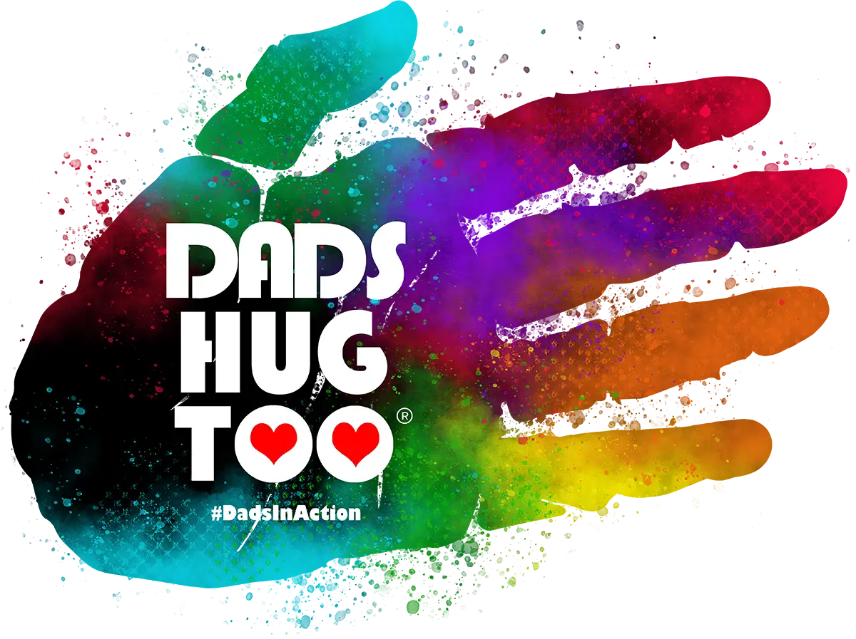
The Solution: I developed a hand that flows seamlessly from Pride colors through Trans/PoC colors, creating a continuous gradient that honors the full spectrum of identities the organization supports. The hand is textured and organic. It reads as real, lived-in, trustworthy. The paint-splatter treatment gives it energy and authenticity, avoiding the sterile feel of typical nonprofit branding.
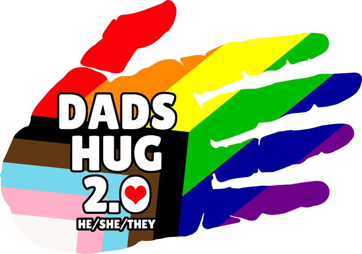
Version 2.0 refined the concept into bold, distinct color blocks. Each finger gets its own Pride color, while the palm clearly displays the Trans flag and brown tones for PoC representation. It’s cleaner and more graphic than the original, making it more versatile across applications while keeping that core message: an open hand, ready to help.